Bioshock - Welcome to Rapture Level Design Analysis
Intro
The first Bioshock still stands as one of my favorite games of all time. As a matter of fact, it’s what got me into level design in the first place.
When I first played it way back when, I fell in love with the city of Rapture. It’s art deco walls, the blue creepy ambience of the water, all of it landed itself into one of my favorite gaming experiences. I decided I wanted to give an analysis to the opening moments of Bioshock to see how it perfectly enthralls you into its city.
Beat Diagram of what I’ll be discussing.
Overview
The opening moments serve as both the tutorial to the basic game mechanics but also our introduction to the sick twisted world of the Bioshock universe. Weveing both these elements together makes the tutorial not feel monotonous or like an after-thought, but rather an important piece of story-telling, something I can take and use with my own levels.
The lighthouse, weenie and beacon of safety.
Lighthouse
When the player gets control of the camera, they awaken in the middle of an ocean. The lighthouse acts as the levels weenie, a big landmark that attracts anyone nearby and can be used to orient yourself around the level. This literal beacon of light does a great job of giving a safe place for players to go to.
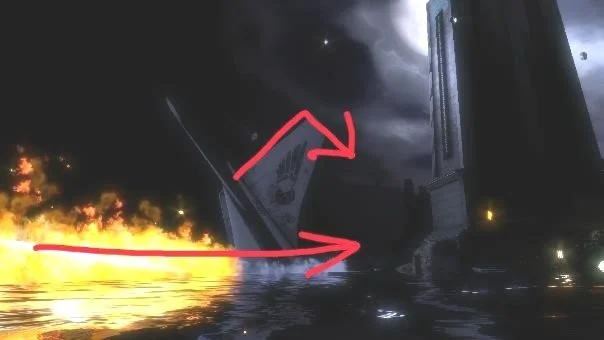
The fire and crashed plane week act as a deterrent to the player, but also offer leading lines towards the lighthouse.
Leading lines towards lighthouse
Lights and stairs make an attractive pathway players will follow
The heavy contrast of light on the outside and pitch black on the inside entices players to enter
Statue of Andrew Ryan - Designing with Proportion
The introduction to the antagonist of Bioshock, Andrew Ryan, is through this statue. Immediately we get a sense of who’s in charge. The scale of the statue in comparison to the player makes the player feel much smaller and less important in comparison to the man the statue depicts. Its golden material makes this man seem rich and healthy. The statue is on a higher plane in the room compared to the player making it feel dominant. Through proportions, material and elevation, the player immediately knows who is in charge and who owns this space.
Intro to Rapture - Designing with Shape
Our first look of the city of Rapture we see Art Deco style of architecture with very uniform square buildings, implying safety found within the city. This makes the city of Rapture inviting, implying stability. However, the city of Rapture is anything but. The sharp triangles that are far back in the city implies a slight danger found within the city of Rapture. This creates an uneasy and unreliable feel of safety.
Offering a View of the First Splicer - Designing Opening & Framing
When the player first steps foot into the city, the player is introduced to the splicers, an enemy in the game. The level takes power away from the player when meeting these enemies for the first time by not giving them a weapon and framing them in such a way that induces fear. The railings provide vertical planes that lead the player’s eye towards the center of the screen. The lighting does heavy work in this scene, offering one window giving light to the scene making the splicer a silhouette causing fear. Framing the splicer in the center of this makeshift hallway as well as exhibiting a light cast from behind introduces and frames the splicers as a threat.
Conclusion
First impressions are everything, and that is no different with video games. Bioshock is an incredible case study of how to entice the audience in the world and introduce the mechanics while keeping the player engaged. This level uses amazing design techniques like leading lines, proportions, shapes, and framing to tell it’s story and teach the mechanics.
This blog was a translated version of a document I wrote for class. If you would like to read it, click the button below to download it.


